


Vanderbilt’s new branding received widespread backlash from Vanderbilt community members following its March 22 reveal. Students, alumni and fans took to social media to express their disapproval of the change.
The university’s press release named Steve Ertel, vice chancellor for communications and marketing, as the lead of the rebranding project. Ertel worked alongside Candice Lee, vice chancellor for athletics and university affairs and athletic director on the change, according to the press release. It further states that the input of over 570 community members gathered over the past two years was considered in the decision. The university did not respond to The Hustler’s request for comment regarding who these individuals were and other details surrounding the change.
Chancellor Daniel Diermeier said in the press release that the decision to change the university’s visual identity comes on the brink of Vanderbilt’s 150th anniversary in 2023. He also stated it reflects Vanderbilt’s recently heightened national and global attention as an academic institution and as a competitor in the SEC. Diermeier, Ertel and Lee emphasized that the new identity aims to unite the Vanderbilt community.
“Our ‘One Vanderbilt’ spirit defines who we are, and we wanted our identity to reflect that,” Ertel said. “We heard from individuals across the university that they wanted our marks to signify who we are today, and that they also wanted to demonstrate stronger unity between the university and athletics. The symbols we use to express who we are as a community help us convey a shared sense of purpose that can guide and inspire us while also attracting others to join and support that shared purpose.”
According to the press release, Upstatement, a digital brand and product design studio, devised the university’s new brand. Upstatement did not respond to The Hustler’s request for comment.
Student reactions
Senior Lukas Berglund created an online petition against the new logo on March 22, which has garnered 2,451 signatures as of print. A survey is included in the body of the petition and asks for opinions on the former and new university logos. The petition reads that the survey responses will be sent to Vanderbilt administrators.
“The new logo is the most generic image you can imagine. It looks like a sad rip-off of the history channel logo,” the petition reads. “The new logo makes me ashamed to be a Vanderbilt student.”
Berglund said the new branding made him realize the extent to which he liked the old logo, particularly the “oak leaf V” design. He further expressed that the branding change is “unnecessary,” diminishes his pride in the university and will likely decrease his chances of donating to the university after graduating.
“You don’t know what you had until you lost it,” Berglund said. “This is really not what Vanderbilt should be working on.”
He said he decided to make the petition to unite the Vanderbilt community for a common cause. However, Berglund stated that he is not confident that it will reverse the university’s decision.
“I knew right away that this was going to be something that nobody was going to like and an issue that we can really unite the campus around,” Berglund said. “The administration is often hard to sway by public opinion.”
Berglund added that he hopes the new logo will not be featured on the Class of 2022’s Commencement regalia. The university did not respond to The Hustler’s request for comment about this possibility.
“Even thinking about that makes me want to throw up,” Berglund said.
Junior Abby Ross signed the petition against the new logo and completed the survey. She wrote in a message to The Hustler that she was “surprised” and “angry” when she first saw the new logo, saying she believes it reflects poorly on the university. Ross stated that she hopes the university reconsiders its design by taking more student, faculty and alumni opinions into account.
“The previous logo was loved and recognized by students, faculty, alumni and the greater Commodore community. We had not asked for a new logo, and in Vanderbilt tradition, our community desires were ignored in favor of the commercialization of this school,” Ross said. “The new logo looks like a knock-off Villanova ‘V’ with a gradient straight out of 1990. I could have made something like this on WordArt, and it is not indicative of an innovative and sophisticated university.”
Senior Kevin Liu is president of Kefi Collective, a student art organization that focuses on making art accessible to students. He similarly criticized the design of the new logo.
“While clean and polished in an effort to follow recent trends towards minimalistic logo design, Vanderbilt’s new logo lacks not only the idiosyncratic star motif that once defined it—but also character,” Liu said in an email to The Hustler. “The resultant design is generic, indistinctive, and unrepresentative of the school that it is meant to portray.”
Brody Haar, an incoming member of the Class of 2026, said the logo is growing on him, but that he still prefers the former design.
“As a graphic designer myself, I originally thought the new logo was a joke. Sometimes simple is better, but I feel like this one doesn’t scream ‘Vandy,’” Haar said. “I think we just need to embrace the change and be willing to adapt. I really liked the [former] ‘Star V’ logo, and I disagree that it looks outdated. I do agree we could use a better logo, but, in my opinion, we could’ve done better than this new one.”
Katie Larson, a fifth-year graduate student, claimed that the new logo deviates from the nature-centric aspect of the former “oak leaf V” logo and reflects the selfish intentions of the university.
“The old logo was charming and reminded us of the natural beauty existing on Vanderbilt’s campus,” Larson said in a message to The Hustler. “The new logo feels soulless and suggests the prioritization of corporate greed over community.”
Alumni reactions
Student sentiment was shared by many members of Vanderbilt’s alumni network. Ethan Fedida (‘12) told The Hustler that, despite characterizing himself as a “very involved” alumnus, he was incredibly surprised by the logo change and feels that more members of the Vanderbilt community should have been consulted in the rebranding process.
“Beyond the surprise, I was incredibly disappointed, upset and mad,” Fedida said in a message to The Hustler. “Not only was something changed without any meaningful or apparent buy-in from the various corners of the Vanderbilt Community, but I know and work with this [alumni] community endlessly and we’re all eager to collaborate and be leveraged by the school to move us forward.”
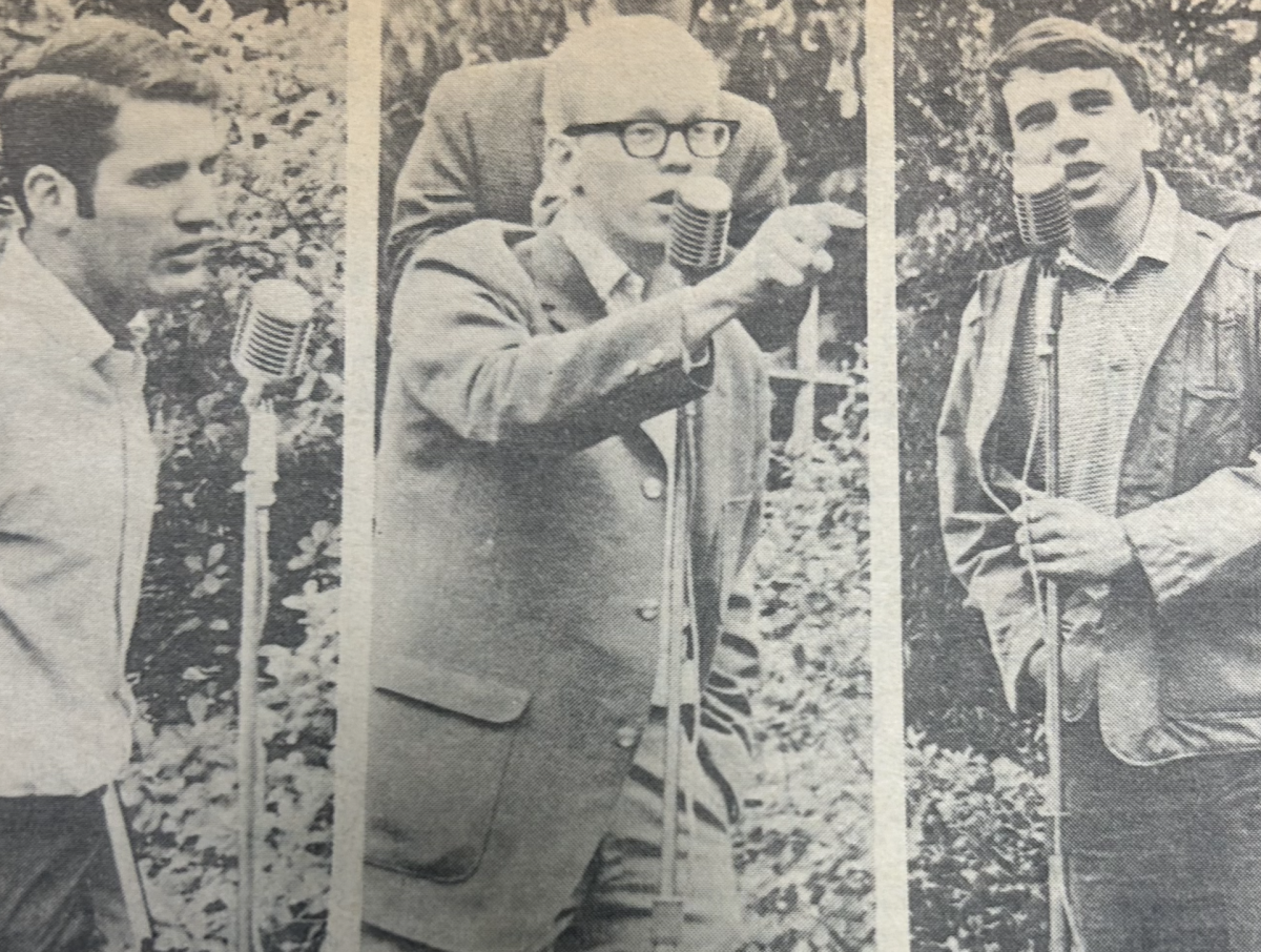
Alumni also took issue with the changes to athletics branding. The “Star V” has been involved with Vanderbilt’s athletics image since the 1960s and, while it will not be completely retired, the “Block V” has now been elevated to the primary athletics logo.
Christian D’Andrea (M.P.P. ‘08), a college football writer for USA Today, wrote an article on March 22 titled “Vanderbilt’s new logo is a tremendous self-inflicted wound.” In the piece, he writes that the new logo “sucks,” and that it attempts to erase Vanderbilt’s athletic history and recent accomplishments.
“The ‘Star V’ was a symbol of hope for a fanbase that had truly gone through the wringer only to have its faith paid off by eventual breakthroughs—bowl games, Sweet Sixteen trips, national championships in women’s tennis, baseball and, most famously, bowling. The new logo wants to throw that away,” the article reads. “Vanderbilt athletics were never about bandwagons or new beginnings, it was about crawling through miles and miles of garbage in hopes of coming out clean on the other side. Those losses made the triumphs, however fleeting, seem special. There’s nothing special about this new logo.”
David Sims (‘05) said he is still connected to Vanderbilt via his athletics fandom and noted that abandoning the traditional “Star V” as athletics’ primary logo will drown the university among the other SEC programs.
“I think it is a terrible decision to walk away from the iconic ‘Star V’ as our athletics logo. It’s recognizable and we ‘own’ it,” Sims said. “How is this plain logo any different than Villanova except for the colors? I talked with a number of classmates—nobody likes it. Hopefully, senior administrators will reconsider this change.”
Fedida echoed that Vanderbilt’s unique “Star V” design differentiated the university from other schools, specifically in athletics and among SEC programs, many of which use lettering as their primary logos.
“[The rebrand] takes one of the most recognizable visible traits of our school in the SEC and nationally and butchers it,” Fedida said. “I’ve never seen something so universally panned as this rollout. EVERYONE hates it. On the bright side, it’s been an incredibly unifying day—in hate—for the Vandy community, and I’m sure it sold a bunch of the ‘old’ merch.”
Fedida said the logo change will likely impact his desire and willingness to purchase Vanderbilt merchandise and contribute to the university. Currently, some merchandise with the updated marks is already available for purchase at the university bookstore, while items with the former logos also currently remain in circulation. Additional items will be made available in the coming year, with the university planning to roll out its updated line completely by Fall 2023.
“I routinely buy Vanderbilt merchandise. I wouldn’t touch this merch if I was paid to wear it,” Fedida said. “On the donation front, it makes me seriously question how funds are being used, if such a large sum of money was wasted on this dumpster fire.”
New York Times baseball columnist Tyler Kepner (‘97) and ESPN baseball insider Buster Olney (‘88) took to Twitter to express their frustration over the logo change.
“Not sure how you could generate something that looks so much like UVAs [the University of Virginia’s logo],” Olney said in a tweet.
Kepner responded to a promotional video Vanderbilt Athletics released about the rebranding.
“Love my alma mater, but these are just cliched, hollow, corporate buzzwords,” Kepner said.
Former Vanderbilt football player Ryan Seymour (‘12) also expressed discontent regarding the logos on social media. Seymour said he was frustrated at how the university will have to change the logos featured inside the new football locker room project in McGugin Center that concluded in June 2021. Student-athletes will begin wearing the new logo on their uniforms starting in Fall 2023, and athletics facilities will gradually transition to featuring the new logos over the coming years as it is “logistically feasible.”
“It took Vandy decades to finally dump some money into updating the McGugin Athletic Center only to change the logo,” Seymour tweeted.


Disgusted Alum • Mar 30, 2022 at 10:14 am CDT
Well done article. Echo other comments pointing out how this is typical of admin to completely ignore community input. The doubling down makes this more embarrassing. Perhaps the elephant in the room is that this is clearly pushed by the new Chancellor that, again, was chosen against the wishes of the community. Ironic that it’s meant to “unify” Vandy and the only unity here is that of disdain. Unfortunately, admin is likely banking on people to forget about this & that the new classes will just go along with it until this branding sticks. Humiliating that this is also now plastered on my LinkedIn page and looks like a high school logo (at best) instead of a prestigious university.
Roger D. Hyman • Mar 28, 2022 at 1:50 pm CDT
I really like the “Star V” logo; it MEANS something. Not only is it distinctive–but it actually does “tie in” with the nickname–Commodores. In the Navy, the rank “Commodore” is signified by . . . ONE STAR. It is equivalent to the rank of “Rear Admiral, Lower Half”–i.e., a ONE STAR Admiral.
The “other” “Oak V” logo was also distinctive, and I agree with the comment that it brings to mind Vanderbilt’s “National Arboretum” designation for the campus.
“New Coke” was a very bad marketing decision made by Coca-Cola; that is the same disastrous mind-set which is bringing this unnecessary “logo change”.
Preston Wilson (A&S, ‘71) • Mar 27, 2022 at 10:43 pm CDT
Really lame
Xxhdusoahd • Mar 27, 2022 at 3:08 pm CDT
I like the logo
Student • Mar 26, 2022 at 5:10 pm CDT
It’s offensive that so much money was spent on this hideous change without an ounce of real outreach for student/campus input. Who was actually surveyed? I’d really like to know. I’m ashamed that my money has gone into this instead of improving actual issues on campus that students/staff have spoken about repeatedly, only to receive silence.
Especially with how much tuition and dining costs went up this year, and how much dining quality decreased despite all of this. Every decision announced recently has made me more disappointed in this administration.
Upset • Mar 24, 2022 at 9:25 pm CDT
God anyone that cares this much about a logo needs to get a life. It’s just a logo. The kids that attend Vanderbilt and spoke for this article are such entitled pricks. Be thankful to go to such an esteemed university rather than point out its flaws.
wrong • Mar 25, 2022 at 10:58 am CDT
L take frankly.
Lara Russell-Lasalandra • Mar 25, 2022 at 12:47 pm CDT
The new logo is so much more than just a logo. It is a symbol of the administration’s refusal to listen to its student body. Objectively, the overwhelming majority of students, faculty, and alum HATE this new “image.” Yet, the chancellor still claims that this new logo was designed using survey feedback and is representative of the community’s wishes. This is a blatant lie and sorely inaccurate. I don’t care how “esteemed” this university is. The administration outright lying, scheming, and ignoring the wishes of the student body is a recurring theme at Vanderbilt (and I am referencing so much more than just this logo change).
No Institution is above criticism. So yes, we will continue to “point out its flaws.”
Class of 2023 • Mar 25, 2022 at 1:02 pm CDT
It’s not even fully about how ugly and basic the new logo looks, it’s about what it symbolizes. Vanderbilt administration didn’t bother to consult the student body or even it’s alumni before making this logo change. All of this money (upwards of $9 MILLION) was spent to fix something that wasn’t broken in the first place. How about putting that money towards Campus dining? Students have expressed their distaste in the options and dining hours on campus; and how about increasing pay for the workers? How about putting that money towards increasing accessibility on campus? And what about multicultural student organizations who are denied extra funding for once-in-a-lifetime events and told “congrats! but you have to pay all expenses out of pocket”? I guess the Administration has shown where it’s priorities lie, and it’s not with the students.
Steven Dougan • Mar 24, 2022 at 9:15 pm CDT
Just another decision by the university that separate what it is from what I once loved.
Disgruntled Alum • Mar 24, 2022 at 2:10 pm CDT
The logo change wouldnt’t bother me THAT much, if not for the fact that it’s a tacky early 2000’s Microsoft Word clipart gradient. Does Yale’s logo have a gradient? Does UPenn’s? Does Duke’s? Is there absolutely zero value to retaining some heritage? The 2007 oak leaf logo, while many are now attached to it, is a modern creation and also corporate nonsense. The truth is that the ivies and other prestigious universities retain their traditional branding. Why Vanderbilt feels the need to constantly upgrade like a halfwit internet start-up is baffling.
You’re all missing the biggest tragedy of this “refresh” though; the school seal. Go on Wikipedia and look at it. It’s an absolute disgrace. Vanderbilt has had the same seal since inception. Top universities, though they do somewhat upgrade and streamline branding with the times (read:somewhat),they DO NOT change their school seals. This is the one bit of heraldry that even the most progressive universities allow to remain timeless and historic. Go look at the nonsense Vanderbilt has replaced our wonderful 150ish year old school seal with. It looks like a glam biker’s tattoo. Then go have a look at other great universities’ school seals. It’s a total embarrassment. And yet the school feels the need to add a Latin motto, to add pretend history. When we have real history that you’ve thrown in the garbage. “Dare To Grow?” What is this, a pre-school moving up ceremony? I’m an alumnus, screw this. This university is embarrassing.
Pls change I’m begging • Mar 24, 2022 at 4:23 pm CDT
Couldn’t agree more. The seal looks like something from a Trump hotel sponsored XFL or esports team. Not to be dramatic, but if that’s on my diploma I will scream. And the gradient???? The entire design is just so cheap and yet so tacky
C.W. Hayes, M.D. FACS A'57,M'61 • Mar 24, 2022 at 1:49 pm CDT
Great piece!