
Spearheaded by Chancellor Daniel Diermeier, March 22, 2022, marked the day when Vanderbilt completely overhauled its visual identity. The university rebranded its classic, beloved “oak leaf V” and “star V” logos into one more modern than the traditional Vanderbilt logo. It’s now the era of the “History Channel” and “Villanova Knockoff.”
Understandably, the initial reaction to this change was unpleasant. But, was the change really that bad? I don’t think so.
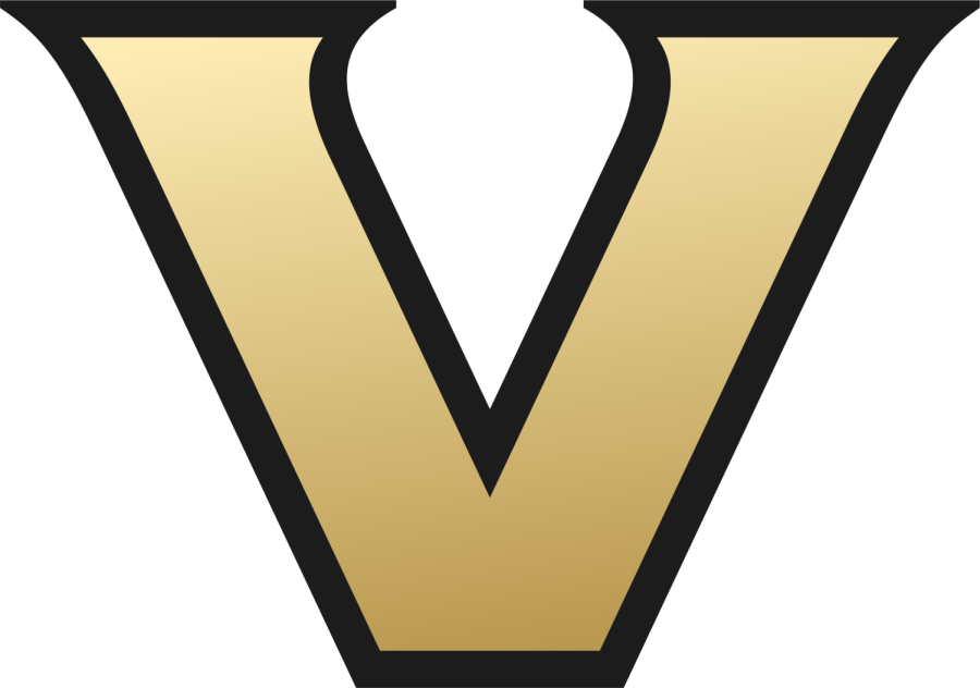
First, I will analyze the new academic logo. While this logo is more simplistic than those previously, it still looks unique to Vanderbilt. No other “V” school features black and gold as its colors. One complaint I frequently hear is that the new logo looks similar to Villanova University’s logo. While the two logos share similarities, Villanova’s logo features distinct slab serifs. Villanova’s logo has a distinct stripe down the middle, even when printed in black and white. I somewhat agree with a more realistic complaint about this logo: It looks like the History Channel logo. While both logos have a similar gold color and a three-dimensional effect applied, these similarities are easily distinguishable due to the different shapes of the letters.

This change is further justified by several new campus projects. Since the start of Diermeier’s reign, the campus has drastically morphed. New construction has been planned on campus, transforming the university. New residential colleges and dining halls have also given the university a fresh look. With these drastic changes on campus, it only makes sense to have that reflected by a change in branding.
The split of Vanderbilt University and Vanderbilt University Medical Center (VUMC) gives another reason for the academic logo to change. Since the two are now separate entities, having separate logos makes sense. Before this logo change, both entities mainly used the “oak leaf V”. For those who are not students, faculty or staff, having two separate entities using the same logo would be confusing. While some students think the University should have kept the “oak leaf V,” I think giving the university a modern refresh keeps pushing it forward, especially since Vanderbilt has changed how it is associated with other nearby entities.
Next, I will look at the new athletic logo. Vanderbilt retired their “star V” logo for a “simplified V” based on the academic logo. The new athletic logo is very similar to the academic logo, which is beneficial because Vanderbilt Athletics has gotten a lot of praise this school year. The football team won its first bowl game in 12 years, donning the new “V.” The men’s and women’s basketball teams are having their best seasons in years with the new “V” as their logo. Women’s soccer got a massive win in the NCAA tournament wearing the new “V.” Bowling won their most recent national championship wearing the new “V.” The new logo has had a lot of sports success during its short lifetime, which gives it a feeling of winning compared to older logos that saw less sports success. This change makes the connectivity between the academic and athletic logos even more powerful and connects the school to a culture of victory.
From a design perspective, the new version is significantly better than the old one. The “star V” took up a lot of space on various implementations. This is a problem because when the logo was applied to a small space, the “V” in the center was oftentimes too small to be easily legible. This old logo can also cause headaches in formatting on various applications, like clothing, television and online media. The new logo eliminates that problem — the “V” shape is the key identifying feature which allows the logo to stand out on any application and make it instantly recognizable.
Many people have complained that the “star V” was recognizable in the SEC. Staying away from that causes Vanderbilt to blend into the background against the other unique logos of a star-studded conference. While the “star V” was recognizable, the new logo still stands out. There are no other “V” schools in the conference; the only other black and gold school is Missouri, whose logo is extremely different.
Overall, I think the new “V” combines a modern design with a classic letter logo in a streamlined way that Vanderbilt has never done before. The current logo will be timeless like no other Vanderbilt logo has been, not suffering from being too busy like the previous “star V” and “oak leaf V” logos. Other shapes frequently had to accompany the letter to make the logo stand out, but now, the letter itself is what stands out.
Many in the Vanderbilt community may have a deep attachment to the older logo. However, I believe everyone should embrace the change in the new logo as it symbolizes Vanderbilt’s progression. Vanderbilt has been improving its status to be at the forefront of progress, and our symbol should reflect that.


WantsABigCommodoreHat • Apr 11, 2025 at 3:44 pm CDT
I like the new logo! It looks much better on TV broadcast and on my phone when I am getting updates on games. You can tell it is a custom letterform. Remember, “simple” is often difficult to achieve. On other topic, who is going to make some custom Commodore foam hats for the games next year–those would look great on the crowd!!
Don • Apr 10, 2025 at 9:36 am CDT
Somebody paid a lot of money for a design that my 8 year old grandson could have come up with and done better. I will continue to wear my Star V proudly. Thank you.
Jessica P. • Apr 9, 2025 at 10:03 pm CDT
The Star V had unique symbolism; the one star represented the rank of Commodore. That’s why we’ve pushed for the re-integration if the star, at least for athletics.
Anon • Apr 9, 2025 at 9:00 pm CDT
This has been one of the worst takes I’ve seen all year
The new logo is boring, the “updated star V” with the larger V looks weird and disproportionate from a graphic design perspective, and if you think changing a logo is all you need to win games…go off I guess
And oh no, people will be confused between the *Vanderbilt* University Medical Center and *Vanderbilt* university!!!! The horror
David B • Apr 10, 2025 at 11:33 am CDT
Please give us back the star with v logo much much better especially on black helmets etc