Correction: A previous version of this article stated the release of Vanderbilt’s new logo was March 23, 2022 instead of March 22, 2022; an image of a Bicentennial Oak tree has been updated.
“Why Vanderbilt?”
I’ve been asked this question many times, and my response has changed notoriously over the years, each reflecting what Vanderbilt meant to me at different points of my journey.
As a high school senior from Vietnam, I was in awe of the limitless classes that had oddly niche and fascinating names, such as The History and Science of Brewing or Hollywood Hanoi. I distinctly remember crafting a Word document delineating why I decided to attend a university that is a 34-hour flight away from home, that I’ve never seen or visited, all for my visa interview. In short, it was the trees. When I became a summer tour guide my sophomore year, my “Why Vanderbilt” answer developed into telling prospective students that it was the community that made Vanderbilt worthwhile. I knew I made the right decision based on interactions with my admissions counselor, the first person that became my Vanderbilt.
Now that I have transitioned to becoming a staff member at the university, my answer is even simpler: Vanderbilt is my home.
While this will always ring true to me, my close family and friends know of one more response that I often offer as a joke but is the most sincere; I chose to stay at Vanderbilt partly because of the logo.
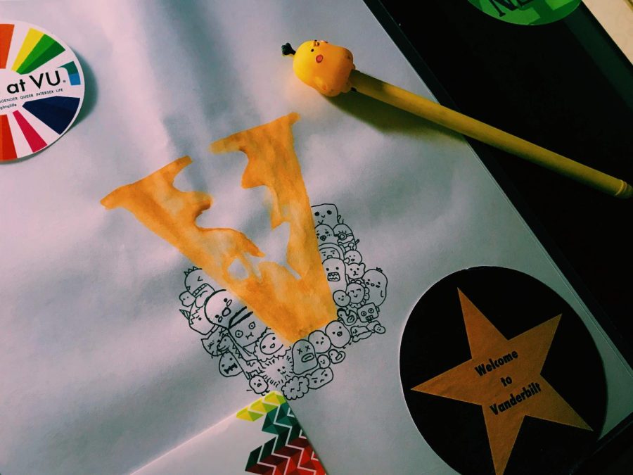
As an international student, I once wrote that choosing to attend Vanderbilt is like a lottery. It means trading everything you know for uncertainty that could potentially be glorious—but also disastrous. I refused to tour the campus virtually or look up any pictures of the campus throughout the application process because I convinced myself that the inevitable blow of a rejection would be softened if I didn’t get attached to any specific aspects of the school. Despite my attempts to distance myself from Vanderbilt, on sleepless nights, I often found myself reading through my tattered copy of Vanderbilt’s school profile and tracing the logo, a proud V with an oak leaf and an acorn, with my fingers.
The logo wasn’t something I paid much attention to until I decided to apply—but it made me sure of my choice. It is bold and crisp but also friendly and inviting. The logo tells me that, while Vanderbilt is first and foremost an academic institution, it is also a community of trust and compassion. The softness of the oak leaf is reflective of a sense of vulnerability and sincerity that I have continuously experienced while interacting with fellow students, professors and staff, who have made Vanderbilt my home.
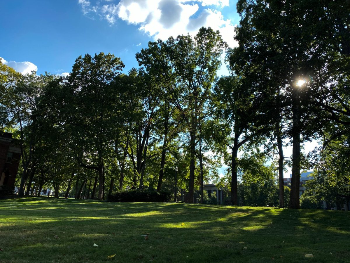
The oak leaf symbolizes our uncanny pride in our squirrel-to-student ratio, the fact that we are somehow an arboretum in the middle of a bustling city and the fact that my professors have become my family away from home.
It represents all the times I have found myself sitting in the basement of a research building adorned with stone acorns, staring at a chubby rodent soaking in the sun next to the window.
While I can spend my days discovering and learning in different lecture halls or labs, I can come home to Rand cookies, Falafel at Midnight, reminisce about the tunnel connecting Towers or try to make a quilt out of all the free T-shirts from campus events. The oak leaf is a symbol of small certainties, such as the fact that the leaves will turn red, or that the flowers will bloom again after an arduous winter. The logo is a gentle reminder of both our history and hope for the future; that a small acorn can, in fact, become a majestic oak tree.
Its asymmetry reminds me that our community is imperfect, but its unity in both shape and color signifies hope. The logo is beautiful because it is simple, and it uses negative space to create meaning. It helps us recognize each other and lets us find a home in one another no matter where we are in this world.
On March 22rd, 2022, Vanderbilt announced its new logo. The logo features a wider, bolder V, but eliminates the spark and warmth created by the former oak leaf logo. Its use of a gradient effect clashes against the minimalist design of our traditional branding style, diminishing the cohesiveness of the color schemes of our websites. A logo, in simplest terms, should be versatile in terms of opacity changes and look good in black-and-white. The use of multiple shades of gold creates difficulties with printing and harmonization; the logo must be altered significantly to be suitable for each media. The icon of the News site of Vanderbilt is now a black bold V, while the school’s official Instagram account announced a giveaway of a cap that simply features the outline of the letter, both eliminating the most noticeable aspect and substance of the new logo.
Vanderbilt’s logo no longer sparks instant recognition and pride. It doesn’t instantly transport us to green lawns and Anchor-Downs. It excludes a substantial part of the Vanderbilt experience: our sense of community.
While I have drawn upon my own experiences, I do believe that there is a universal message behind the oak leaf logo. Vanderbilt is many things to each of us, but the differences create a common thread: the unique beauty of traditions, culture and human connection. As the campus changes colors again and is awakened by a new breath of life, I feel a sense of excitement and melancholy. Change is something to be celebrated, and I recognize that nothing stays the same.
Vanderbilt’s oak leaf logo already has achieved what a symbol of a university should be: it was a tribute to all of us, and it should stay.


David M. Victor, A&S '80, Law '83 • Jul 3, 2022 at 4:08 am CDT
My reaction to this “rebrand” can be summed up in one simple word: Why? Our Alma Mater is not a fast-food restaurant or a box of cereal. It doesn’t require an occasional logo re-tweak to stay “trendy” or “relevant.”
As other commenters have pointed out, the Vanderbilt “acorn” symbol wasn’t just pulled out of a hat. It has a history. It means something. It meant something to me as a student. It means something to me as an alum. It means much more than its proposed replacement by a generic alphabet letter plucked out of list of sample fonts.
I proudly join the call to relegate the new “V” logo to the same cobwebbed shelf as the Edsel, New Coke, green Keinz Ketchup, and other marketing disasters. Don’t try to fix what isn’t broken.
Paul Sarlo • Mar 28, 2022 at 2:46 pm CDT
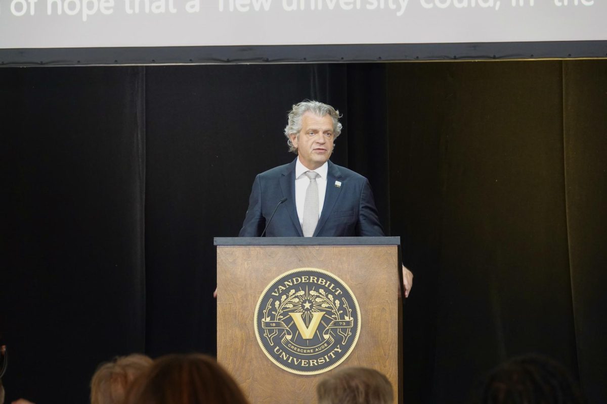
I am an alumnus of Vanderbilt University’s College of Arts and Sciences. Your article is brilliant and insightful. Like so many others, I was most disappointed in Vanderbilt’s decision to scrap the oak leaf V logo, which is a timeless icon of the University and its brand. You may know that sculpted oak leaves and acorns adorn the stairs, gates, and chandeliers at Grand Central Station in honor of the Vanderbilt family. The oak leaf V logo is also part of the stonework and glasswork at various locations throughout Vanderbilt’s campus. I recently wrote to Chancellor Diermeier and informed him that I will not consider giving to Vanderbilt until it restores the oak leaf V logo.
Just a few years ago, the University of South Florida, which is located in Tampa, attempted a rebrand of its own. When the school unveiled its new logo, the public reaction was so vehemently negative that the school decided to abandon it, even though it had cost about a million dollars to create. In response to the school’s decision to drop the new logo, one alumnus, who happened to be a member of the school’s first football team, said: “Part of leadership is acknowledging when mistakes are made, placing egos aside and making it right.” I believe this statement to be true.
Vanderbilt’s leadership needs to show courage and strength by acknowledging its mistake and returning to the oak leaf V logo. Courage and strength. That is what we expect from our leaders. If Vanderbilt allows its mistake to live on, it will only wind up spending even more money on the new, unpopular logos, while further alienating the public, the student body, and the alumni base in the process.
Thank you.
Respectfully,
Paul Sarlo, Esq.
Class of 2005, Vanderbilt University
Acorny • Mar 24, 2022 at 9:37 am CDT
Thank you for sharing your story. The oak leaf logo is so strongly associated with Vanderbilt that it’s a shock it would be discarded. It’s not just the association with the Vanderbilt family crest, but as many students have pointed out, it’s really unique to be learning and growing on a campus that is a designated arboretum. It’s a part of the campus identity in a way that a plain V is not. The oak leaf is a powerful symbol of wisdom, strength and endurance. I will go a step further after reading the objectives stated and say that Vanderbilt needs to stop having an inferiority complex to the Ivies. They can still be a world recognized institution in their own right. I am sorry, but the majority of students, and especially esteemed faculty do not choose Vanderbilt due to their athletic teams. I have no problem in a slight tweak of Star V for athletics and Acorn/Oak Leaf for academics. In my opinion, they have overstated the need to unite logos in order to promote Vandy United. Fine, spend money on your athletics programs, that’s ok but this is like saying the rest is insignificant. I hate complaining because I truly love this University but this is way off mark.
PeterK • Mar 27, 2022 at 9:27 pm CDT
“Vanderbilt needs to stop having an inferiority complex to the Ivies.” for the past 40 years Vanderbilt has been changing itself to be more like the Ivies. It is no longer the school I graduated from almost 50 years ago
Student • Mar 23, 2022 at 9:53 pm CDT
Anh, you perfectly summed up how I feel about our oak leaf logo. Its uniqueness was an instant source of school pride for me, and now I’m frankly embarrassed to say I go here (which used to very rarely happen) when I see the new logo because it feels like every other school and that I’ve lost my connection to the Vandy I knew. I guess the only good thing to come out of this change is the student body bonding over how bad the new one is. Thank you for this incredible piece!