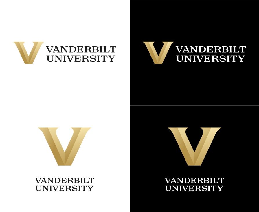
Vanderbilt faced criticism from students, alumni and fans when it unveiled its new visual identity on March 22. As part of the branding change, the university redesigned its logos and marks in an effort to strengthen Vanderbilt’s uniqueness, per the university’s press release.
Steve Ertel, vice chancellor for communications and marketing, led the rebranding project. He worked with Candice Storey Lee, athletic director and vice chancellor for athletics and university affairs. On March 25, The Hustler spoke with Ertel and Lee before they led a virtual presentation to local media.
Ertel and Lee said the branding change stemmed from a larger effort to establish a university identity. Ertel said Vanderbilt’s many facets necessitate a unified, central mantra. He claimed that its strong balance of academics and athletics combined with its partner medical center and research facilities enable it to engage in “radical collaboration.”
“We come together in ways that many other universities can’t,” Ertel said.
The pair also stated that the array of logos used before the change did not effectively unify the different sectors of the university under one identity. As a result, they said Vanderbilt is now establishing the “block V” as a uniform symbol that can be utilized in different capacities across the different areas of the university.
“There [was] a lot of inconsistency,” Ertel said. “We wanted to create greater alignment, so we went through this identity process that had nothing to do with the marks.”
Rebranding process
Ertel said no community members were given early access to mock designs, claiming that it can be “difficult to contain” a brand refresh if drafts are leaked. Student-athletes were shown the marks when the university felt that it had settled on its final designs, prior to its public reveal.
In the early stages of the project, Ertel stated that a select group of students, alumni, faculty and staff were consulted to discuss topics concerned with Vanderbilt’s identity as part of the “500 completed surveys, 70-plus one-on-one interviews and dozens of workshops and group engagement sessions” mentioned in the university’s press release. The Black and Gold Club, Vanderbilt’s student-athlete alumni network, and Vanderbilt Fan Council, a select group of fans chosen to help athletes improve game day experience, were also both consulted throughout the design process.
Per Ertel, many of these individuals were later recontacted specifically in regards to the logo change. They were asked about what they did and did not like about the university’s former logos and what they would like to see reflected in future marks.
Ertel explained that the university consulted Lee and Vanderbilt athletics on the project early on because student-athletes generally don university logos and marks more than most other members of the Vanderbilt community. Lee added that her involvement in the design process emphasized the conjoinment of athletics and academics that she has felt since Chancellor Daniel Diermeier assumed his role.
“Block V” design
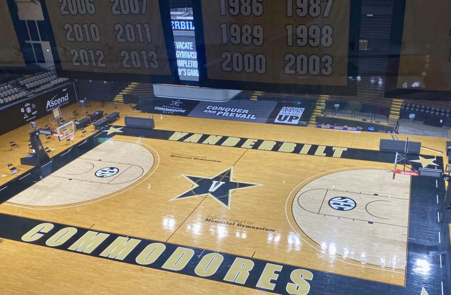
Ertel said the university chose the “block V” as the unifying symbol of its new brand. He explained that this consistency was lacking in the university’s previous brands, as athletics primarily used the “varsity V” and “star V,” while the university and Vanderbilt University Medical Center (VUMC) largely used the “oak leaf V.”
The “block V” is meant to reflect boldness and to assert Vanderbilt as a leader among its academic and athletic peers, per Lee. Ertel echoed that he believes Vanderbilt has the ability to make its new “block V” the most recognizable out of other institutions that use the letter as their logo when asked about other schools like the University of Virginia and Villanova University. Both Lee and Ertel said the new visual identity is intended to make Vanderbilt more of a household name around the country.
“The direction that we’re moving as a university, including as an athletics department, is to be more than we’ve ever been,” Lee said. “We’re trying to be out front, and we’ve not always acted like that. The challenge for us is to rise to what we set.”
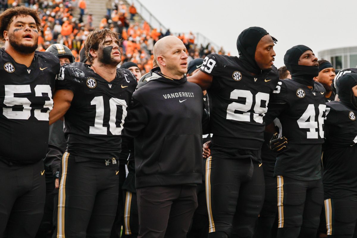
Lee added that, throughout the design process and in the past, many coaches expressed strong preference for the “V,” over the “star V.” She cited the baseball team’s use of the “V” on their hats in previous years and football head coach Clark Lea’s use of a football-specific “block V” helmet this past season.
“The idea was we share a ‘V,’ we own the ‘V’ as the community,” Ertel said. “Then, from the V, we built out the system which is flexible, and we’ll keep working through it. But it’s got this flexibility to say, ‘as long as we’re sharing this, it says we’re on the same team, we share the same identity.’”
Ertel emphasized that there are opportunities to adapt the symbol for varying audiences and branches of the university. He and Lee referenced different variations of the “block V” within the logo catalog, such as those that position the “V” on a star, next to the word mark and on the new seal.
For example, Vanderbilt is currently in communication with VUMC—which is independent from the university—and its CEO and chief marketing manager about changing their brand to align with the university’s new visual identity. The university is willing to collaborate with VUMC to create an adaption of the “block V” in the future, per Ertel.
“We are talking to the medical center now. We oversee a trademark licensing agreement, so they license the mark from us,” Ertel said. “They are very interested in this, and so we’ll be talking to them about what they want to do.”
Ertel confirmed that the “oak leaf V” will still be on Commencement regalia, including gowns, diplomas and diploma seals for the Class of 2022 due to production timelines. However, other aspects of the ceremony, including banners and programs, will be updated to reflect the new logos.
Response to backlash
While both Lee and Ertel asserted that the logos will remain in use regardless of backlash, they feel that the new set of logos offers flexibility for community member preferences. Lee noted that coaches will have the ability to choose what logos from the system appear on their teams’ uniforms, merchandise, gear and facilities—including at the center of courts and fields.
Ertel emphasized that the university’s previous visual identity changes were also initially criticized. Lee added that the significance and emotional connection to a brand and logo comes with time.
“What we have to do is make sure—regardless of what the mark is—that it’s important and, no matter where you are in time, whenever the mark is at that time, it is important to you,” Lee said.
Lee compared the change in branding to the university’s ongoing West End construction.
“The university’s been here since 1873, but symbols do change. This footprint, very soon, will look very different. West End Avenue looks very different. When my teammates come back to campus for homecoming, they’re all upset because every place we used to live is just about gone,” Lee said. “But the university is still here. The identity is still there.”
Ertel explained to reporters that many local and professional teams, as well as universities, have reached out to them in assertion that brand changes receiving initial negative feedback is “par for the course.” Lee and Ertel also noted that they have heard a lot of positive feedback to the change despite the backlash.


