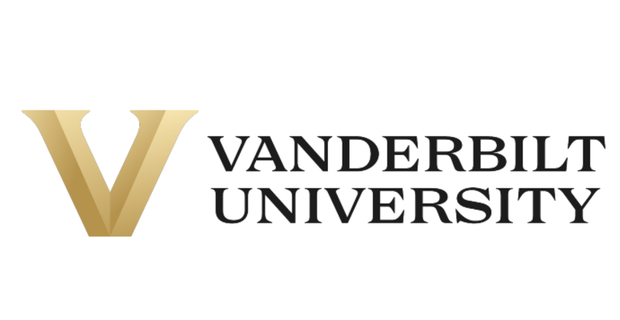

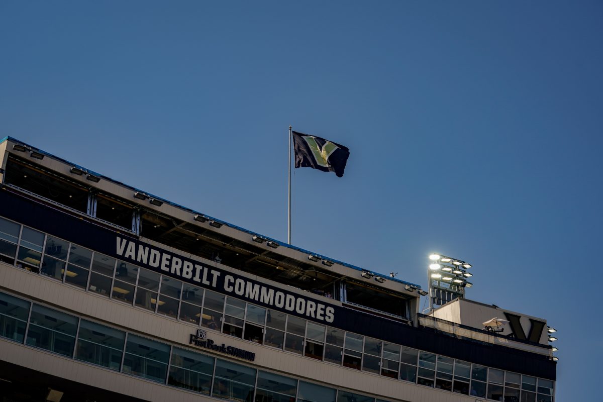
Vanderbilt University released its reimagined university and athletics visual identity on Tuesday in a press release. The new identity will introduce a series of new logos and marks to be rolled out on a gradual basis starting in late March. It will establish more universal branding for both the university and the athletics department centered around a “Block V” logo.
“All great institutions have a clear sense of themselves. As we prepare to celebrate our 150th anniversary next year, it’s time for Vanderbilt to sharpen our expression of who we are and what makes us unique. As we look ahead, we believe that a strong sense of self will direct and accelerate our growth and evolution,” Chancellor Daniel Diermeier said in a press release. “This new visual identity is designed to help build and share the pride in our collaborative community and to bring greater visibility to our university across the country and around the world.”
Previously, the “V” with an oak leaf inside of it and the “Star V” served as the primary logos for both Vanderbilt University and Vanderbilt Athletics respectively. According to a press release from Vanderbilt athletics, the “Star V” will not fully be retired and that an updated version will be available at some point for use.
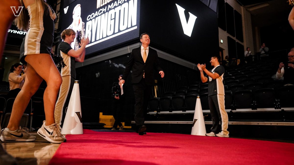
“From my perspective, the timing is perfect in that it illustrates the ‘new era’ that we have spoken of often,” athletic director Candice Lee said. “It’s a new day, with new energy, alignment and momentum to match. It’s another example of ‘Vandy United’ in action.”
“It’s time for a refresh and we can’t be afraid of that.”
— Vanderbilt Athletics (@vucommodores) March 22, 2022@VandyAD
https://t.co/erAS0qQhql#AnchorDown pic.twitter.com/by7EtrSNA3
According to the release, Vanderbilt’s current “V” with an oak leaf and acorn was adopted in 2007, and the “Star V” has been in use since 2000. The release states that athletics uniforms will debut the new logo in fall 2023 and that athletics facilities and playing fields will be updated over the next “several years” as logistics permit.
Extensive research from polling and interviews informed the university’s decision to update its visual identity. More than 500 surveys, 70 one-on-one interviews and many workshops and group engagement sessions were conducted over the past two years to inform its new design. The Commodore Fan Council and the Black and Gold board of advisors also contributed to research efforts.
In addition to logos and marks, the identity re-imagination includes a new university seal. The seal still has the university’s motto, “Crescere aude,” or “dare to grow” and features a darker backdrop and gold lettering. The university explained in the athletics press release that Vanderbilt is “evolving” and that it is ready to shed its former roots as a, “great regional university” with hopes of becoming a national brand.
“Vanderbilt’s story is evolving. We’ve outgrown our “great regional university” identity to become one of the nation’s most elite private research institutions with a significant international presence,” the release stated in response to the question of why changes were needed. “As a member of the Southeastern Conference, we are continuously in the spotlight and must distinguish ourselves among our peers. A bold, refreshed visual identity reflects the Vanderbilt of this moment, enhances the strength of our national and international reputations, and inspires our continued progress and growth.”
For the project, Vanderbilt used design studio Upstatement. Vanderbilt previously worked with Upstatement on the university’s new website in 2021 and more information on the previous collaboration between the university and the firm can be found here.


3 Dores Down • Mar 27, 2022 at 1:02 pm CDT
This secret process appears to have caught most alumni off-guard (3 alumni in my family), so how “extensive” could this research possibly have been? General feedback (mostly negative) would suggest that this initiative was completely unnecessary and Vandy didn’t engage the alumni community in this process.
G Davidson • Mar 25, 2022 at 12:57 pm CDT
Who exactly were these surveys sent to as well as who were the 70 one-on-one interviews and with whom were these workshops. These individuals failed public opinion or at the very least VU administration mislead them to achieve the outcome they were looking for, why else go to such lengths? I live in Nashville and my wife is a graduate of VU but I can no longer continue to support this university as they continue to take misstep after misstep.
“Extensive research from polling and interviews informed the university’s decision to update its visual identity. More than 500 surveys, 70 one-on-one interviews and many workshops and group engagement sessions were conducted over the past two years to inform its new design. The Commodore Fan Council and the Black and Gold board of advisors also contributed to research efforts.”
Hire a Professioinal Chef • Mar 24, 2022 at 9:17 pm CDT
High 5 to the new “V”, NOT!
BA • Mar 23, 2022 at 10:19 pm CDT
Diermeier clearly only cares about money, so we should all NOT donate this year to get them to change it back.
Anonymous '22 • Mar 22, 2022 at 5:48 pm CDT
For a university that strives to fit in with the upper echelons of academia, this logo feels like a step backwards. For new students, seeing this cheap logo surely doesn’t inspire images of a bustling academic community. I wouldn’t be opposed to keeping this for strictly sports branding purposes, but keep the classic acorn V logo, it’s the best representation of Vanderbilt.
Anon fan • Mar 22, 2022 at 4:01 pm CDT
A response from a fan:
“Vanderbilt’s new logo is a tremendous self-inflicted wound”
Miguel Moravec • Mar 22, 2022 at 3:48 pm CDT
The problem isn’t just that this logo looks cheap and generic. The problem is that Diermeier’s admin completely excluded community input on this, as usual.
.
This huge identity change should never have been delivered to fans via a surprise, unsolicited email. Instead, this could have been the start of a months long, honest conversation with input from the whole community. The basic question, should we even change the logo, should have been attempted. Generating buy-in 101
.
Donors: looks like admin wants to lose your dollars again this year. Sign the petition below to reinstate the old logo (1000+ signatures in last few hours) and don’t give a penny on giving day
Miguel Moravec • Mar 22, 2022 at 4:48 pm CDT
https://www.change.org/p/keep-the-old-vandy-logo?redirect=false
Miguel Moravec • Mar 22, 2022 at 9:26 pm CDT
https://www.change.org/p/keep-the-old-vandy-logo
Vandy2 • Mar 22, 2022 at 2:53 pm CDT
Vanderbilt athletics needs a NIL program, not a new logo.
Olivia (She/Him) • Mar 22, 2022 at 2:38 pm CDT
The new Vandy logo is worse than Nickelback
Current MBA at Vanderbilt OGSM • Mar 22, 2022 at 1:29 pm CDT
I’m stunned that anyone would sign off on this. The stately and timeless logos that have represented this University are being replaced by graphics that could have easily been created on Microsoft Paint during someone’s lunch hour. Very poor decision, I hope it doesn’t end up on my diploma.
Employee at Vanderbilt • Mar 22, 2022 at 1:48 pm CDT
I couldn’t agree more. The Vanderbilt brand has been cheapened by this. Change is ok but make sure it can withstand the test of time.
Anon • Mar 22, 2022 at 12:41 pm CDT
Incredibly bad logo. Who even thought this was a good idea?
Alum • Mar 22, 2022 at 11:40 am CDT
This logo is horrendous and somehow the athletics logo is worse. More change for the sake of change…
Alum • Mar 22, 2022 at 11:29 am CDT
It stinks! The old branding was timeless, this looks awful.
Anon • Mar 22, 2022 at 11:11 am CDT
Lol this is ridiculously ugly. I don’t know where they get their committees from but they need to find a new process