

As many universities in the U.S. have reopened, they have launched COVID-19 dashboards tracking active cases on their campuses. Vanderbilt’s dashboard exhibits similarities with many peer universities’ dashboards, as well as some significant differences.
The reopening of college campuses across the country has resulted in demands for transparency about the spread of COVID-19 to avoid the shutdowns experienced by students in March of this year and more protective measures to keep everyone safe. Specifically, The Vanderbilt chapter of American Association of University Professors (VAAUP) has petitioned for the university to have measures in place for the health of the university community throughout the pandemic.
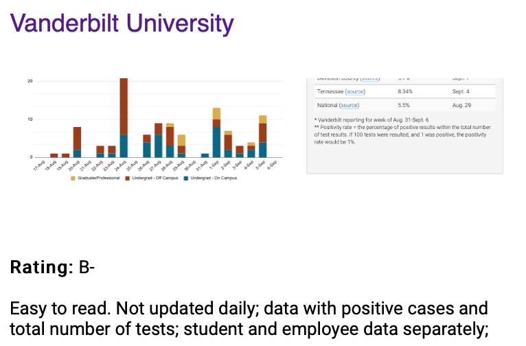
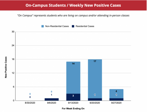
Vanderbilt’s COVID dashboard includes data on positive test results for three categories: students living on-campus, students living off-campus and faculty, staff and post-doctoral students teaching or working on campus. In addition, the dashboard also compares Vanderbilt’s positivity rates to county, state and national positivity rates.
The Hustler looked at eleven different public and private peer universities and examined their dashboards for their transparency, clarity and timeliness.
Comparisons to peer institutions
Private nation-wide universities
The Hustler compared Vanderbilt’s COVID-19 dashboard to other private, peer universities located out of state with rankings in the top 20 of U.S. News and World Report’s 2021 Best National Universities. These recent rankings placed Vanderbilt at number 14, a bump up from last year’s rank of 15.
Specifically, The Hustler examined the dashboards of eight schools: No. 10-13 Northwestern University, Duke University, Dartmouth University, Brown University, No. 15-18 Rice University, Washington University in St. Louis, Cornell University and the University of Notre Dame. These eight schools are the four above and below Vanderbilt’s ranking on U.S. News’ list.
Although Vanderbilt includes multiple data points and infographics in its dashboard, some peer universities include information that Vanderbilt omits.
For example, Duke University’s dashboard publishes quarantine and isolation data, including how many students are in precautionary quarantine and how many have been released from quarantine. There is also a column that displays how many people who contracted the virus have been cleared to return to normal campus activities.

In addition to weekly results, Duke also includes a table that exhibits the cumulative results since Aug. 2. However, Duke does not show a daily breakdown of positive cases, nor does it calculate the positivity rate or compare their numbers to the regional or national averages.
The University of Notre Dame’s dashboard is updated daily rather than weekly and incorporates all of its data into one infographic. Unlike both Vanderbilt’s and Duke’s dashboards, it includes estimations of recovered people and active cases.

Additionally, it distinguishes between surveillance and diagnostic testing. Surveillance tests at Notre Dame include random asymptomatic testing, while diagnostic tests are conducted following the identification of symptoms or through contact tracing. Notre Dame’s analysis also includes a seven-day moving average. However, it does not distinguish between faculty and student positive cases in the chart.

Out of the eight schools examined—Northwestern, Duke, Dartmouth, Brown, Rice, Wash U, Cornell and Notre Dame—four include quarantine or isolation data in their dashboards, which Vanderbilt does not provide. By releasing the number of students currently in quarantine and noting how much isolation space remains, universities can give their communities a sense of how well they’re managing spread and whether they have sufficient capacity in the event of an outbreak.
Five of the eight schools also release their data daily or as soon as a day’s results are available. This contrasts with Vanderbilt’s practices, in which results for the prior week are released every Monday.
Other Tennessee universities
The Hustler also examined the dashboards of the University of Tennessee system as a point of comparison between Vanderbilt and Tennessee public universities.
The University of Tennessee system, which includes four different universities, provides data about each institution and the system as a whole. The collective University of Tennessee system tracks the number of students in isolation and quarantine, active student cases and active employee cases in one graph. Furthermore, unlike Vanderbilt, the graph allows for specific date selection to show the spread of the virus over different time periods.

Private Institutions in Nashville
Belmont University’s dashboard includes separate charts for student and faculty positive cases per week, but unlike Vanderbilt, does not show a daily breakdown.

In contrast, Lipscomb University’s dashboard only includes data for the prior week and does not distinguish between student and faculty results. However, Lipscomb does include numbers of students and employees in quarantine or isolation, which Belmont and Vanderbilt do not.

Examined Schools’ Testing Strategy
Along with inspecting these universities’ dashboards, The Hustler also looked into these universities’ testing strategy to show the overall representativeness of their dashboards.
Vanderbilt enforces weekly, mandatory testing for all undergraduates authorized to be on campus. Northwestern enforces weekly, mandatory testing for its undergraduates while performing random recurring testing for all graduate and professional students along with its faculty. Duke does not specify their specific testing schedule. Its website states that Duke performs regular surveillance testing for all students and staff on- and off- campus. Notre Dame follows a Bayesian stratified and staggered-entry rotating cohort design for its surveillance testing.
Belmont provides testing for symptomatic individuals and anyone determined by Health Services to require testing. Similarly, Lipscomb tests any students that are showing symptoms of COVID. The University of Tennessee provides testing for symptomatic students and for asymptomatic students who are close contacts of a COVID-19 case and students identified in a positive pool through the campus systematic testing program.
Dashboard Ratings
We Rate COVID-19 Dashboards is a team runs by doctors and students from universities across America. Its twitter account that rates university dashboards, @CovidDashboards, gave Vanderbilt’s dashboard a “B” rating on Sept. 21.
“Easy to read. Not updated daily; data with positive cases and total number of tests; student and employee data separately,” the website reads.
Vanderbilt’s previous rating, which was posted to the website almost one month prior on Aug. 31, was also a B. Of the eight peer private institutions examined, only three had a B rating or lower.

The Hustler spoke with Tomi Ojo, a fourth-year medical student at Harvard on the We Rate COVID-19 Dashboards team.
“[The goal is] that every institution gets an A++, that universities are transparent in the data they share with their communities and local communities so that everyone is safe as they can be during this pandemic,” Ojo said.
The team has not yet awarded an A++ rating to any institution.
As to their rating scheme, Ojo stated that some criteria are considered more heavily than others. A school’s dashboard would receive a higher rating if the data provided is more comprehensive. She further explained this through a common feature that COVID dashboards contain: positivity rate in county and state. Universities would get a point for including this to begin with, but they get two points if they include the trends of this data.
In terms of Vanderbilt’s rating specifically, Ojo pointed out some strengths and opportunities for improvement in Vanderbilt’s dashboard.
“Vanderbilt very clearly states how many tests are being conducted on campus, which is important,” Ojo said.
Ojo explained that such data reporting is important because that way a viewer can see the number of positive tests in context with the total number of tests.
She also gave credit for Vanderbilt’s separation of student and employee data, which she says is essential to staff understanding their own personal risk of coming to work. However, there are multiple areas in which Vanderbilt’s dashboard has room to improve.
“[The dashboard] doesn’t speak to how many students are being isolated or in quarantine,” Ojo said. “It doesn’t publicize the testing strategy, or how quickly results come back.”
Though Vanderbilt’s testing strategy is not displayed on its COVID dashboard, it is published on a separate website.

Ojo also emphasized that transparency about the amount of time between the test itself and isolating students with positive results is essential to prevent spread.
According to Ojo, another piece that can improve a dashboard is the inclusion of how schools assess their operational status based on COVID-19 transmission.
Operational status is a rank or level that identifies the current level of risk and the procedures in place for that status. An example of this is Cornell University’s COVID-19 “Alert Levels,” which range from “Red: Shut Down” to “Green: New Normal.” Cornell displays the current alert level as well as the campus guidelines and transmission frequency that would accompany each respective alert level.
In an email to The Hustler, Vanderbilt stated that after the first two weeks they decided to move to a daily breakdown of the COVID statistics but did not commit to any specific changes moving forward.
“We may, as the semester continues, make additional changes and updates to the dashboard,” the email from Vanderbilt Public Health Command Center reads. “The situation is fluid and we cannot lock ourselves into only one way of doing things if we find better or more efficient ways to do them.”