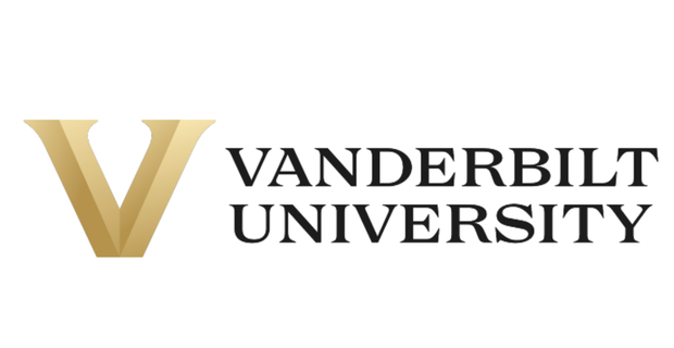
Vanderbilt University released its reimagined university and athletics visual identity on Tuesday in a press release. The new identity will introduce a series of new logos and marks to be rolled out on a gradual basis starting in late March. It will establish more universal branding for both the university and the athletics department centered around a “Block V” logo.
“All great institutions have a clear sense of themselves. As we prepare to celebrate our 150th anniversary next year, it’s time for Vanderbilt to sharpen our expression of who we are and what makes us unique. As we look ahead, we believe that a strong sense of self will direct and accelerate our growth and evolution,” Chancellor Daniel Diermeier said in a press release. “This new visual identity is designed to help build and share the pride in our collaborative community and to bring greater visibility to our university across the country and around the world.”
https://twitter.com/vucommodores/status/1506286562803392518
Previously, the “V” with an oak leaf inside of it and the “Star V” served as the primary logos for both Vanderbilt University and Vanderbilt Athletics respectively. According to a press release from Vanderbilt athletics, the “Star V” will not fully be retired and that an updated version will be available at some point for use.
“From my perspective, the timing is perfect in that it illustrates the ‘new era’ that we have spoken of often,” athletic director Candice Lee said. “It’s a new day, with new energy, alignment and momentum to match. It’s another example of ‘Vandy United’ in action.”
https://twitter.com/vucommodores/status/1506346439198265351
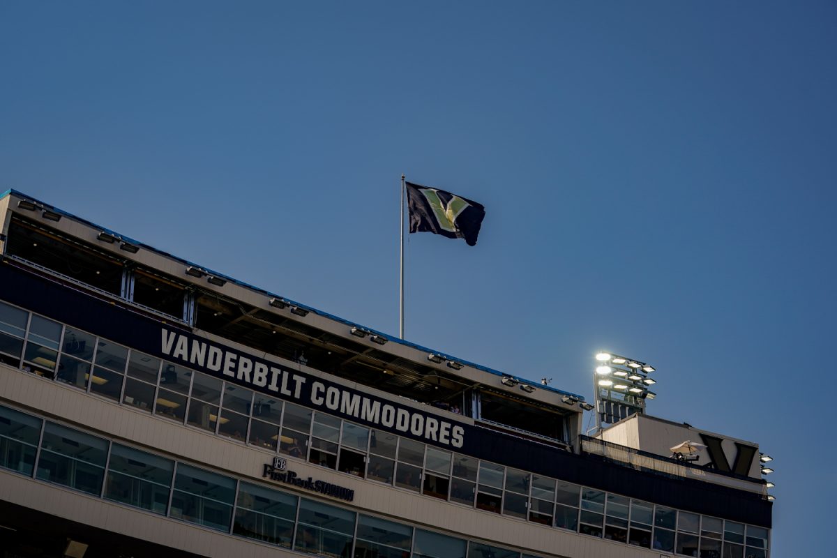
According to the release, Vanderbilt’s current “V” with an oak leaf and acorn was adopted in 2007, and the “Star V” has been in use since 2000. The release states that athletics uniforms will debut the new logo in fall 2023 and that athletics facilities and playing fields will be updated over the next “several years” as logistics permit.
Extensive research from polling and interviews informed the university’s decision to update its visual identity. More than 500 surveys, 70 one-on-one interviews and many workshops and group engagement sessions were conducted over the past two years to inform its new design. The Commodore Fan Council and the Black and Gold board of advisors also contributed to research efforts.
In addition to logos and marks, the identity re-imagination includes a new university seal. The seal still has the university’s motto, “Crescere aude,” or “dare to grow” and features a darker backdrop and gold lettering. The university explained in the athletics press release that Vanderbilt is “evolving” and that it is ready to shed its former roots as a, “great regional university” with hopes of becoming a national brand.
“Vanderbilt’s story is evolving. We’ve outgrown our “great regional university” identity to become one of the nation’s most elite private research institutions with a significant international presence,” the release stated in response to the question of why changes were needed. “As a member of the Southeastern Conference, we are continuously in the spotlight and must distinguish ourselves among our peers. A bold, refreshed visual identity reflects the Vanderbilt of this moment, enhances the strength of our national and international reputations, and inspires our continued progress and growth.”
For the project, Vanderbilt used design studio Upstatement. Vanderbilt previously worked with Upstatement on the university’s new website in 2021 and more information on the previous collaboration between the university and the firm can be found here.

